Fordes
Visual identity for training company
Fordes is a training company focused on improving the skills and capacities of small, medium and large entrepreneurs and professionals from different areas such as accountants, financiers, salesmen, lawyers or creatives.
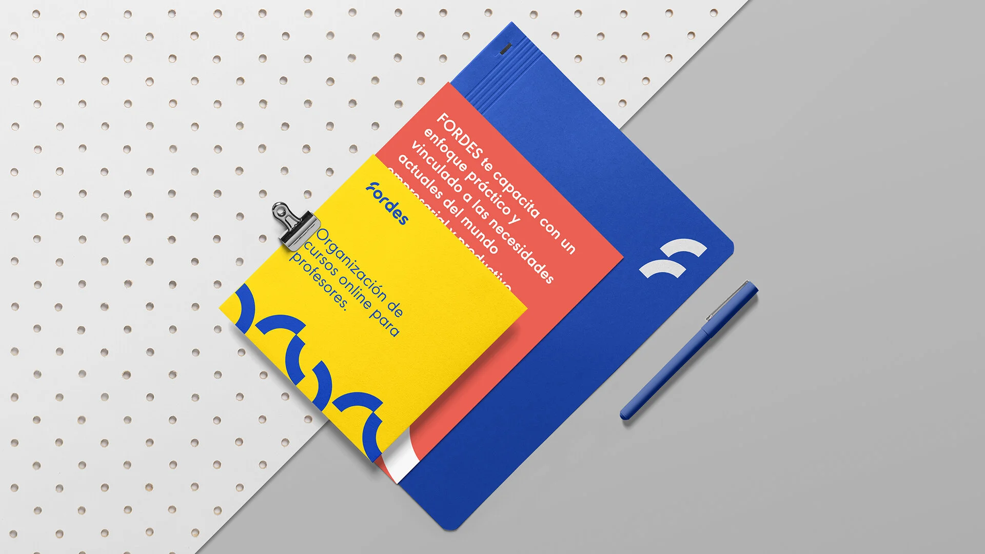
The visual identity was approached from a vision that simplifies communication. We designed a typographic logo that includes the corporate symbol in the initial of the name, the letter F formed by 2 semicircles, one on top of the other, which represent constant growth based on knowledge and experience acquired.
With a dynamic and powerful color palette made up of 3 primary colors, we generate a communication system that allows wide possibilities of contrast and composition.
We designed a typographic logo that includes the corporate symbol in the wordmark combined with a dynamic and powerful color palette in the initial of the name


