Green Harmony
Visual identity and packaging
Green Harmony is an Ecuadorian company specialized in natural essential oils. They contacted us to design their identity and packaging for their extensive line of essential oil products.
The challenge in this project was to find a creative solution for the labels of the products that could differentiate each of the essences and, at the same time, unify the entire product line.
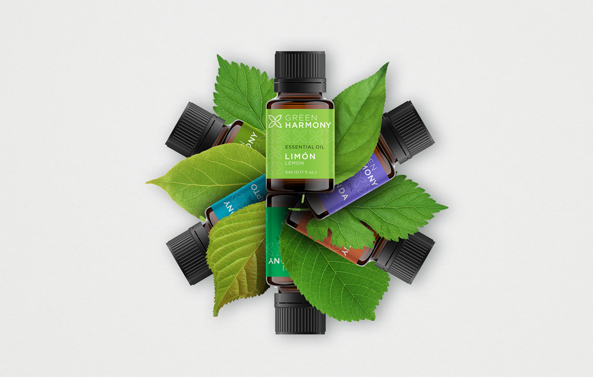
When dealing with very small labels, we generated a 2-ink system, using a decorative graphic pattern generated by the logo symbol. The result was a modern, elegant and attractive label system.
We design a simple and attractive label system that can transmit the different fragrances through sight.

Logo

Icon

Label system
Product line
We design the packaging of the oils emphasizing the brand and using typographical elements to keep the communication clean and tidy.
Packaging for oils


Promotional products baner
Product brochure
